The Throughput Run Chart: Analyze the quality of your throughput, with Wiveez
The analysis of Flow Metrics is essential to understand and optimize the performance of an agile team.
Among these metrics, the Throughput Run Chart, offered by the Wiveez digital application, stands out as a powerful tool for monitoring and analyzing a team’s throughput over various periods.
Designed to adapt to Agile frameworks such as Scrum, SAFe or Kanban, this tool provides in-depth analysis thanks to advanced functions such as quartiles, control limits and natural process limits, all enriched by integration of our brand new artificial intelligence, named Alice.
In this article, we will explore how the Throughput Run Chart works, its benefits for different roles in a team, as well as the practical use of the analysis tools it offers.
What is the Throughput Run Chart?
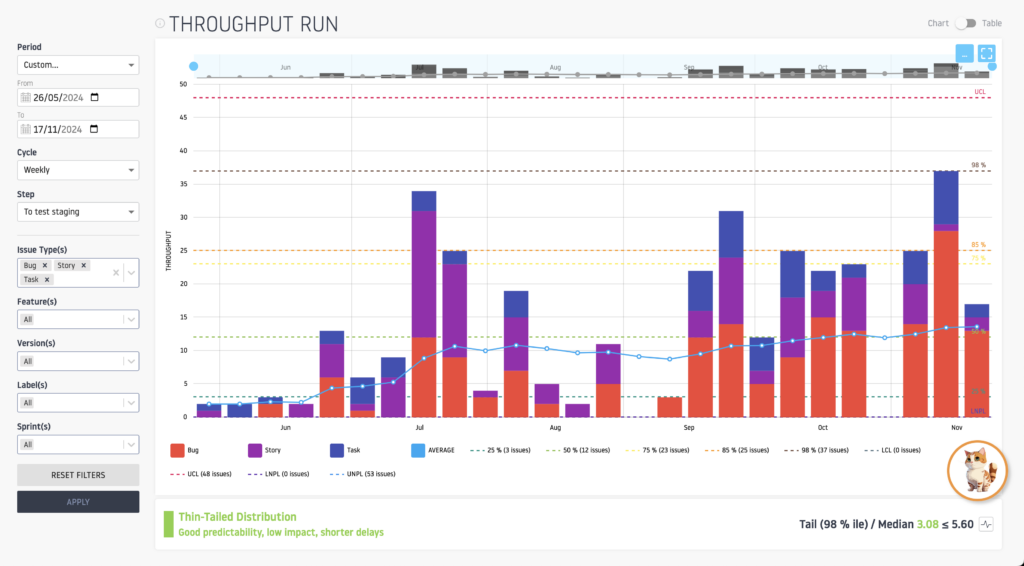
The Throughput Run Chart is a graph that tracks a team’s throughput history, i.e. the number of tickets completed over a given period. Through the Wiveez application, users can view this flow according to different frequencies:
- Daily
- Weekly
- Every two weeks
- Every three weeks
- Monthly
In addition, the Throughput Run Chart offers great flexibility thanks to its numerous filters, notably by Feature, Label, ticket type, version and sprint. This customization makes it a tool adapted to the reality of each team, whatever its agile methodology.

Why use the Throughput Run Chart?
For the different roles of an agile team
- Product Owners and Product Managers: The Throughput Run Chart provides a clear view of the team’s ability to deliver value over a given period. This facilitates planning, prioritizing backlog items and managing stakeholder expectations.
- Scrum Masters and Agile Coaches: Using this tool, they can identify trends or anomalies in team flow. Significant fluctuations can be analyzed to understand their causes: overload, systemic problems or changes in practices.
- Release Train Engineers (RTE): In a SAFe context, the Throughput Run Chart helps RTEs monitor and optimize the throughput of Agile Release Trains (ART). By monitoring overall trends and variations, they can identify train-wide blockages and coordinate initiatives to improve synchronization and overall flow.
- Team members: The Throughput Run Chart provides transparency and helps to better understand the team’s work dynamics. This allows everyone to visualize how their contributions influence the overall flow.
For the all organization
The Throughput Run Chart is also a strategic tool for project portfolio managers and executives. It allows you to compare the performance of different teams, detect systemic bottlenecks and identify opportunities for continuous improvement.
Advanced analysis with quartiles, control limits and natural process limits
Wiveez integrates advanced analysis tools into the Throughput Run Chart to strengthen decision-making.
Quartiles
Quartiles divide the flow data into four groups, each representing 25% of the observations. This allows us to understand the variability of the flow:
- The first quartile (Q1) indicates the slowest periods.
- The third quartile (Q3) highlights the fastest periods.
By visualizing these quartiles, teams can adjust their expectations based on typical performance and avoid relying on extremes.
Control limits (LCL: Lower Limit Control / UCL: Upper Limit control)
Control limits are calculated from historical flow variations. They define the limits within which the flow is expected to remain in a normal situation. If a flow value falls outside the control limits, this indicates a potential anomaly to be investigated.
- UCL (Upper Control Limit): Upper control limit.
- LCL (Lower Control Limit): Lower control limit. These limits are typically set at 3 standard deviations above and below the mean, meaning that 99.73% of the data should fall within this range in an “in control” process.
For example :
- An exceptionally high flow rate can signal unusual team effort, but also a risk of burnout.
- Exceptionally low flow may indicate blockages or overloading.
Natural process limits (LNPL: Lower Natural Process Limit / UNPL: Upper Natural Process Limit)
Natural process limits define the normal range of variation for a stable system. Unlike control limits, they take into account systemic factors of the work environment, such as team size or average work volume.
By tracking these boundaries, teams can assess whether their performance is consistent with their intrinsic capacity or whether structural improvements are necessary.
- UNPL (Upper Natural Process Limit): Natural upper limit.
- LNPL (Lower Natural Process Limit): Natural lower limit. These limits reflect the natural range of variation of the process, defined by accepted specifications or tolerances, not by statistical deviations alone.
To find out more, do not hesitate to read the article “Understand and Use Quartiles, Control Limits and Natural Process Limits to Optimize Your Flow Performance”.
Alice: Your virtual assistant to enrich the analysis of your flow using artificial intelligence

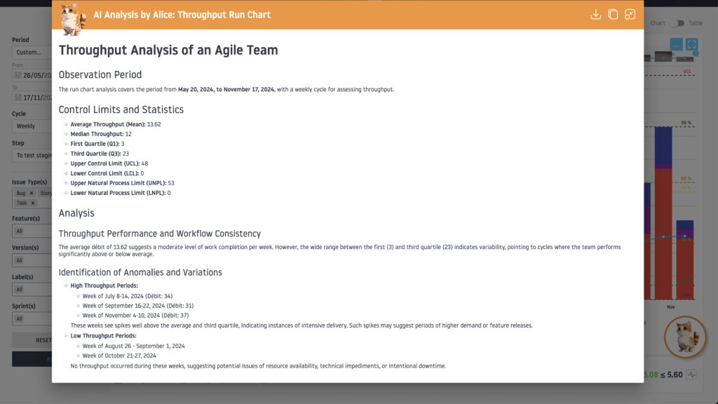
To go further, Wiveez has integrated Alice, an artificial intelligence dedicated to graph analysis.
Alice is your personal virtual assistant who will help you interpret trends and anomalies in the Throughput Run Chart by offering concrete suggestions and tailored recommendations.
Alice will be available, in beta, from November 28, 2024 and will be presented exclusively at the Agile Tour Montreal conference.

Conclusion
The future of agile teams lies in their ability to transform complex data into strategic decisions.
The Throughput Run Chart, enriched by advanced Wiveez features and Alice AI intelligence, provides teams with a unique opportunity to visualize and optimize their workflows.
With in-depth analysis and personalized recommendations, this tool becomes much more than a simple table: it is an engine for agile transformation and continuous improvement.


