
OPTIMIZING THE VALUE FLOW: THE KEYS TO IMPROVING THE EFFICIENCY OF THE FLOW AND THE DISTRIBUTION OF TIME
In today’s competitive world, organizations are constantly looking to optimize their processes to deliver value to their customers faster and more efficiently.
Within the framework of Lean and Agile practices, improving the value flow has become a central pillar for increasing productivity and customer satisfaction.
To help organizations achieve this objective, two analysis tools are available: the flow efficiency analysis graph and the flow time distribution analysis graph (Flow Time Breakdown).
These analytics tools provide valuable insights into how work moves through business processes, revealing opportunities for improvement often hidden in the complexity of daily operations.
This article explores how these two metrics, when used in conjunction, can not only diagnose inefficiencies in value streams, but also guide teams in implementing concrete improvement strategies.
By diving into flow efficiency and flow time allocation analysis, we’ll discover how to identify bottlenecks, reduce lead times, eliminate waste, and ultimately accelerate the delivery of value to customers.
What is Flow Efficiency?
Flow efficiency is a key metric in Lean and Agile methodologies that measures the proportion of time an item actually spends through value-added activities compared to its total time. crossing the flow (Lead Time).
In other words, it measures the percentage of time that work is actually running, as opposed to periods of waiting, checking, delays, or inactivity.
Flow Efficiency is inspired by Lean principles of minimizing waste and optimizing processes to maximize value for the customer. In this context, value-added activities are those that directly contribute to the progression or improvement of the final product or service, while non-productive time is considered an opportunity for improvement.
How to calculate Efficiency?
Flow Efficiency is a fairly simple calculation, generally expressed as a percentage.
But before making any calculations, two essential steps are necessary:
1 – Identify the steps that will make up the request activity flow;

2 – Define the “active” steps and the “waiting” steps (buffer). The last stage of the flow, corresponding to the end of processing the request, is not taken into account in the efficiency measurement.

As soon as these 2 steps have been completed, simply collect information on the “Completed” requests:
- Time spent on value-added activities;
- Total time of the request processing cycle (Lead Time)
Then apply the formula:

Example:
- Request 1 was processed in 14 days;
- She spent 4.25 days on high added value stages;
- Its efficiency is therefore (4.25 / 14) * 100 = 30.36%
High flow efficiency indicates that a large portion of cycle time is dedicated to tasks that directly deliver value, which is ideal in any Lean-Agile process.
Conversely, low flow efficiency reveals inefficiencies and waste in the process, such as excessive delays, blockages, or redundant processes, requiring attention and corrective action to improve flow smoothness and efficiency. of work.
Flow Efficiency Chart
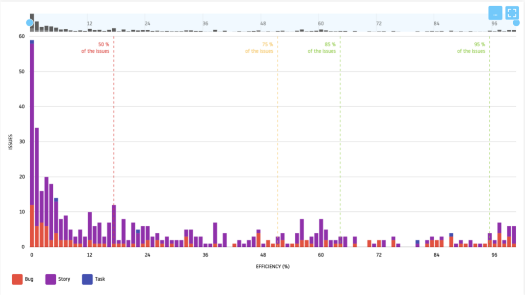
The Flow Efficiency Chart is a visual tool for analyzing and improving the efficiency of work processes.
This graph graphically represents the proportion of time (as a percentage) spent on value-added activities.
How to analyze Flow Efficiency?
Fig. 3 represents the distribution of efficiency by type of demand.
With the help of quartiles we can analyze this graph as follows:
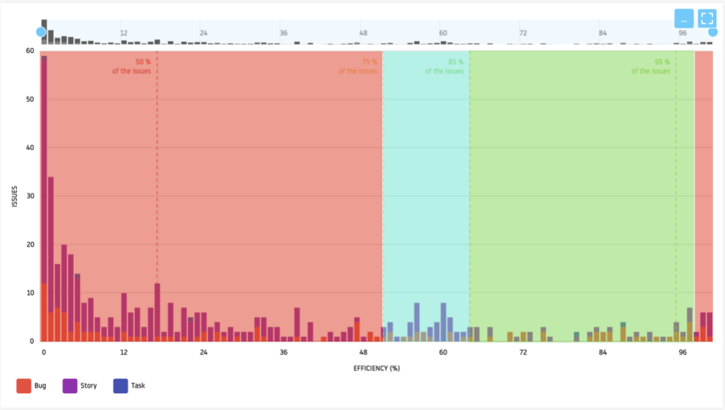
We can analyze that:
- 50% of requests have an efficiency less than or equal to 16%;
- 75% of requests have an efficiency less than or equal to 51%;
- Around 25% of requests have an efficiency greater than 50%.
In this specific case, the observation is clear, we are in the presence of a “sick” flow of activity requiring in-depth analysis to determine the causes.
Beware of extreme values
The race for greater efficiency should not be an end in itself and should not be a pretext for a lack of respect for the processes in place. The best efficiency is that which factually and honestly represents the reality of the health of the system.
If we return to Fig. 3, we can see that some requests have an efficiency of 0% and others an efficiency of 100%. These extremes must be analyzed in order to identify their relevance.
Consider a demand with an efficiency of 0%.
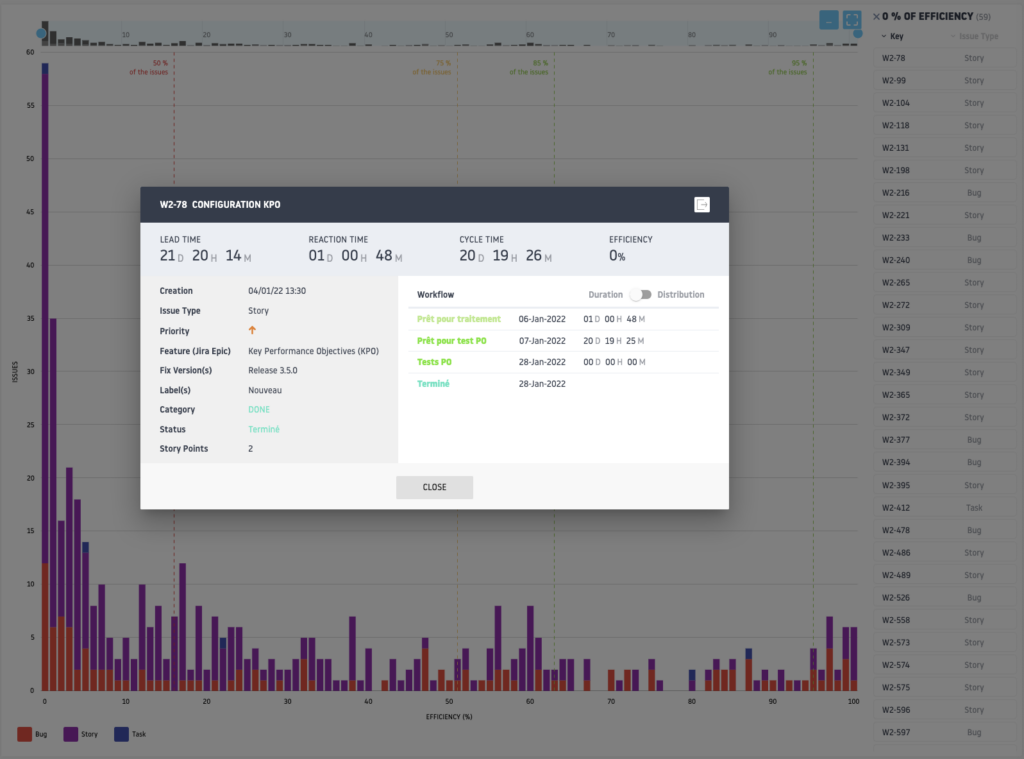
We can see that demand has not moved through some of the stages of the flow, particularly those considered value-added stages. The only time it encountered an “active” stage (PO Tests) it lasted less than a minute.
Let us now take the case of a demand having an efficiency of 100%, which may seem excellent.
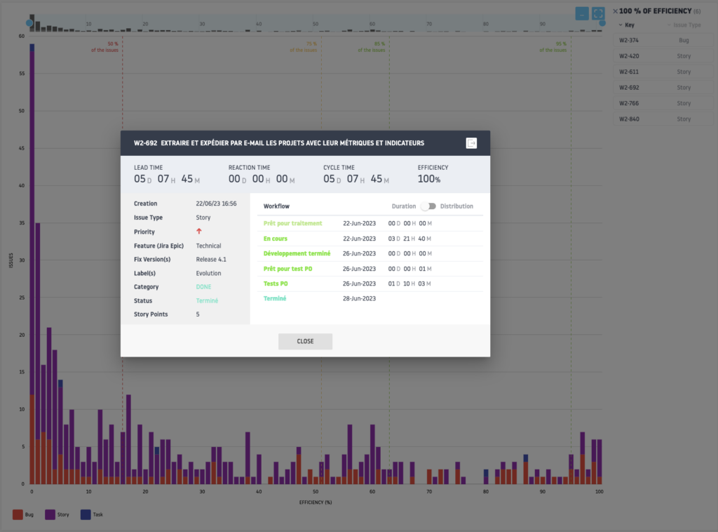
We can easily analyze that this request spent no time (or just 1 minute) in a waiting stage and that it even failed to go through certain stages, such as “Analysis” or the “Pull Request”.
These 2 examples are blatant cases of non-compliance with the value flow management process, generating incorrect monitoring indicators and potentially leading to poor decision-making.
It is therefore essential to ensure the quality of the data and compliance with the request processing process, before launching any indicator analysis.
Continuous improvement with Flow Time Breakdown
Now that we have noted “disrupted” efficiency, we must analyze the reasons in more detail and in particular when the request takes too long and/or finds itself blocked.
For this, there is Flow Time Breakdown or Flow Time by Step, allowing step by step analysis of the time taken by requests.
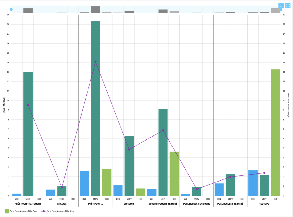
Flow Time Breakdown is a detailed analysis that breaks down the total time spent on a task into different categories or phases, helping to understand how time is allocated throughout the life cycle of a task. work item.
This method aims to clearly identify which phases add value and which are wasteful, such as waiting times or delays, in order to optimize workflow and improve overall efficiency.
Usefulness of Flow Time Breakdown.
- Identifying Waste: By breaking down time flow, organizations can identify precisely where and how waste occurs, whether it is unnecessary delays, redundant processes or any other form of inefficiency.
- Process Optimization: With a clear understanding of time allocation, teams can target specific improvements to reduce or eliminate waste, thereby speeding up workflow and increasing overall efficiency.
- Continuous Improvement: Flow Time Breakdown serves as a basis for continuous improvement (Kaizen), allowing teams to constantly adjust and refine their processes to better meet speed and quality requirements.
Flow Time Breakdown is a powerful analytical tool that provides a granular view of flow time, highlighting optimization opportunities and contributing to the implementation of more Lean and Agile processes.
Let’s analyze our activity flow.
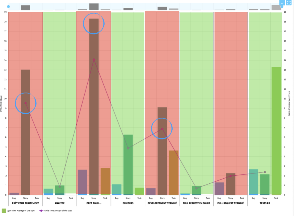
Value-added steps are displayed in green. Waiting steps are in red.
We can easily see that the steps consuming the most time are those corresponding to “buffers”, for a total of more than 30 days, out of a Lead Time of 45 days.
The team must now identify the reasons for these significant waiting times and what actions to implement to remedy them, as part of a process of continuous improvement.
Conclusion
In conclusion, flow efficiency and flow time distribution charts prove to be invaluable instruments in the journey towards operational excellence and continuous improvement in the value stream.
By providing a clear and concise visual representation of how time is allocated across different phases of work, these tools enable teams to demystify the complexity of their processes and highlight critical areas requiring attention.
Flow efficiency, with a focus on the ratio of time spent on value-added activities to total cycle time, provides a powerful measure of process performance.
It helps quickly detect inefficiencies, such as unnecessary delays or extended periods of inactivity, that dilute value and slow delivery.
On the other hand, flow time decomposition provides a detailed perspective on the distribution of time between different activities, making it easier to identify bottlenecks and opportunities for process optimization.
However, it is crucial to emphasize the importance of having clean and reliable data to power these analyses. The quality of the insights generated by these graphs is directly linked to the precision and relevance of the data entered. Inaccurate or incomplete data can not only confuse the interpretation of graphs but also lead to erroneous decisions, compromising improvement efforts.
Integrating these tools into the organization’s culture of continuous improvement therefore requires meticulous attention to data collection and management, as well as a deep understanding of how to interpret and act on the insights provided.
By engaging in this process, teams can not only improve the efficiency of their workflows but also strengthen their ability to quickly deliver value, respond to changing customer needs and remain competitive in a competitive environment. increasingly demanding market.
Ultimately, flow efficiency and flow time distribution charts are more than just measurement tools; they are a reflection of an organization’s commitment to excellence, transparency and continuous improvement, thereby propelling work processes to new heights of efficiency and effectiveness.


