


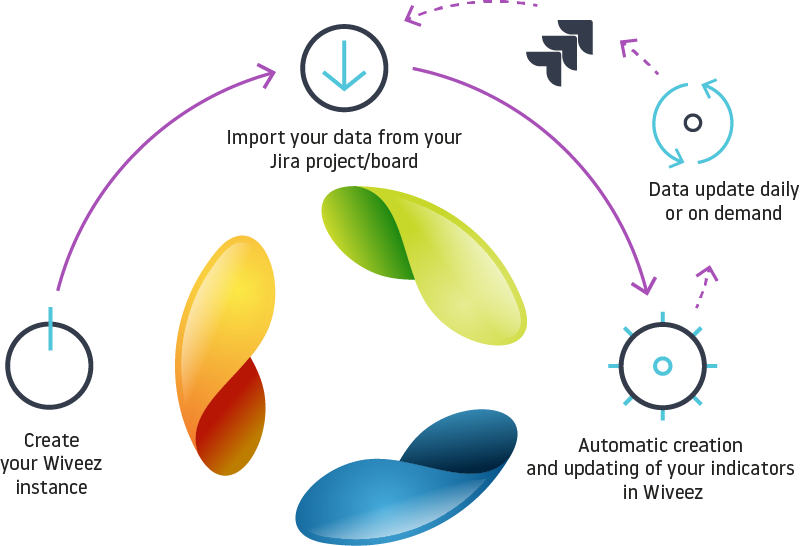
A fully automated solution for generating Lean-Agile indicators.
Our collaborative digital platform automatically collects, analyzes and consolidates your data from your JIRA projects without any human intervention.
DASHBOARDS
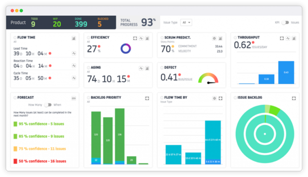
MONITORING INDICATORS
Monitoring of indicators, at Product, Version, Feature (Epic Jira) or Label level.
- Ticket flow, by ticket type; • Aging of tickets;
- Average predictability Scrum;
- Anomaly rate;
- Average throughput/day by ticket type;
- Track tickets by priority;
- Flow tracking by Story Point.
- Forecast with Monte-Carlo simulation (When, How much).
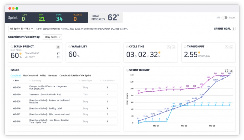
MONITORING SPRINTS
- Scrum predictability by Story Point, Ticket, etc.
- Monitoring sprint variability. Difference between the starting backlog and the end of sprint backlog
- Monitoring of average ticket processing time within the sprint
- Average flow monitoring
- Sprint progress monitoring graph (Sprint Burnup chart)
- List of tickets completed, in progress, added, deleted, completed outside the sprint.
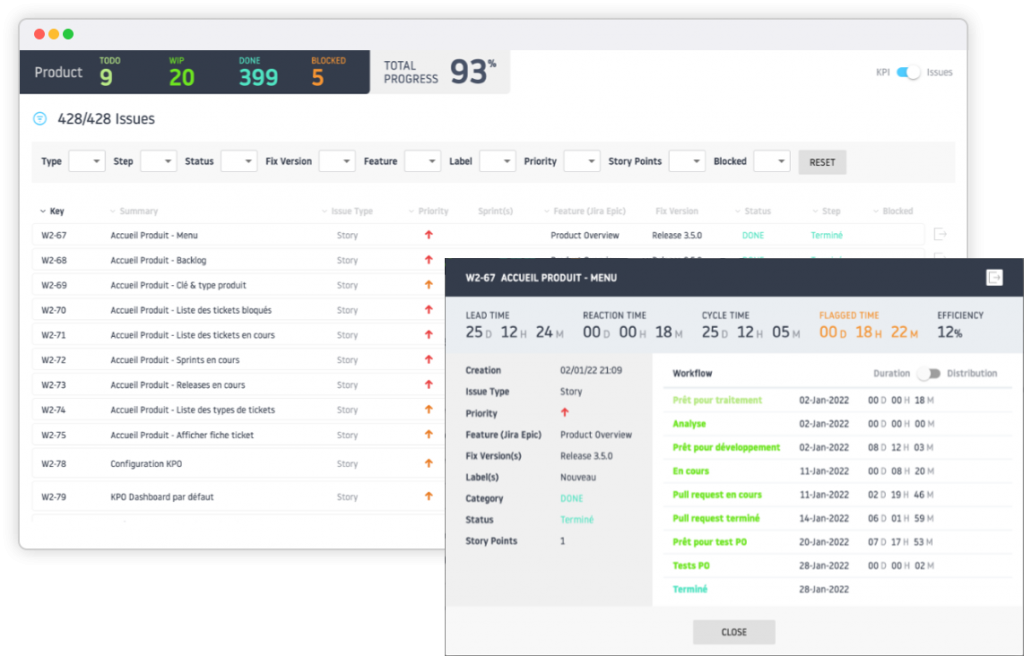
ANALYSIS OF REQUESTS
Management by dashboard, with filter module (Type, Flow stage, Status, Version, Feature, Label, Priority, Sprint, Story Point, Ticket blocked or not).
ANALYSIS
History of passage of tickets in the processing flow and monitoring of its personal indicators (Travel time, Reaction time, Processing time, Blocking time, Efficiency).
ADVANCED ANALYSIS
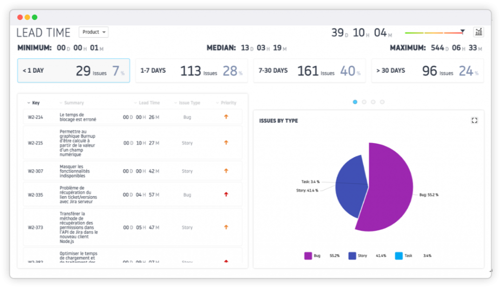
Analyze all of your monitoring indicators (Lead Time, Reaction Time, Cycle time, Throughput, Efficiency, Aging of tickets.
ADVANCED ANALYSIS
Crossing time, handling time, processing time, throughput, efficiency, time spent on tickets in progress The analysis is available on the dashboards: Product, version, feature (EPIC Jira), label.
TRACKING CHARTS
Filter the results with a large number of possibilities (version, label, period, start and end step of flow measurement, ticket type, etc.). Details of tickets (monitoring sheet of personal indicators). Export graphs or single data in several available formats.
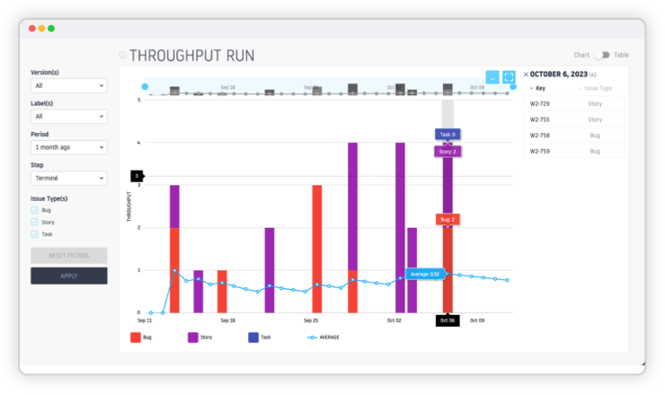
Daily Flow Tracking
The best way to measure the evolution of a team’s throughput performance.
Visualize the amount of work the team completed each day, for a workflow step. Measure the evolution of the team’s rolling average throughput, over a period and a workflow step.
Throughput
Visualize the team’s daily throughput frequency, on each stage of the value stream and request type part.
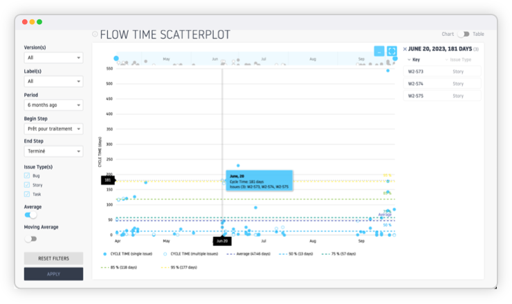
Flow Time Scatterplot
Ticket dispersal and processing time in the blink of an eye.
Visualize, over a period of time and on a specific workflow, the time it took to process tickets.
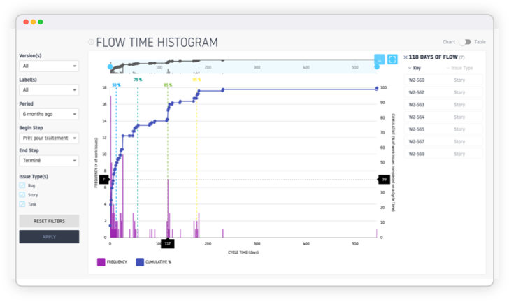
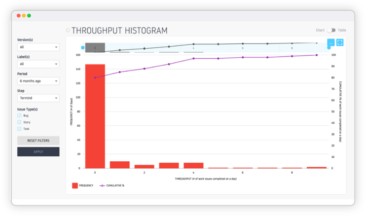
Flow Time Histogram
Analyze flow time dispersion over a value stream step interval.
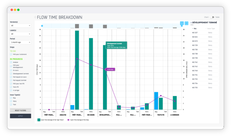
Flow Time Breakdown
View the average time taken by a ticket type, across each of the workflow stages (To Do, In Progress), as well as the stages on which tickets spend the most time and identify bottlenecks affecting performance flow and system efficiency.
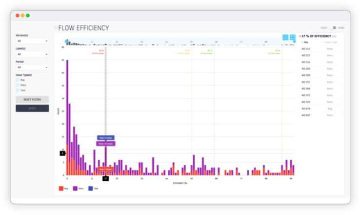
Efficiency
Analyze the dispersion of efficiency of demands on the value flow.
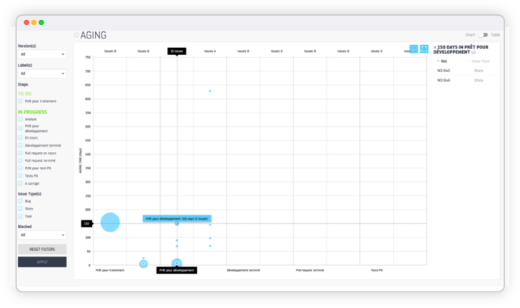
Aging
Analyze the aging time of requests in the outstanding value stream.
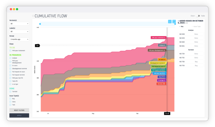
Cumulative Flow Diagram (CFD)
The Cumulative Flow Diagram (CFD) allows you to analyze the amount of work at different stages of a process over time. It identifies bottlenecks, monitors workflow, and assists in data-driven decision making.
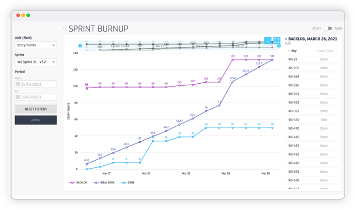
Sprint Burnup
The Sprint Burnup allows a Scrum team to monitor the progress of the demands of a sprint, compared to an ideal curve, as well as the impacts of a variation in the Sprint Backlog.
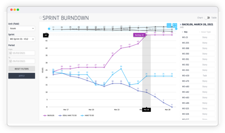
Sprint Burndown
Sprint Burndown allows a Scrum team to monitor the requests remaining to be processed in a sprint, compared to an ideal curve, as well as the impacts of a variation in the Sprint Backlog.
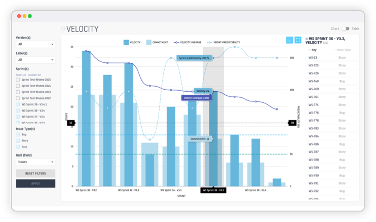
Velocity Chart
The Velocity Chart allows you to monitor the performance of a Scrum team on each Sprint completed or in progress, by comparing the ratio between commitment and achievement (predictability), as well as the evolution of velocity.
Precisely filter results for ultra-accurate indicators
FORECAST
Filter the results with a large number of possibilities (version, label, period, start and end step of flow measurement, ticket type, etc.). Details of tickets (monitoring sheet of personal indicators). Export graphs or single data in several available formats.

The MonteCarlo Simulation
« How many »
Based on historical flow, run probability projections on how many tickets can be completed over a given time period at 95%, 85%, 75%, or 50% confidence.
Export charts and their data easily!
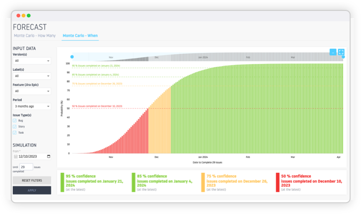
The MonteCarlo Simulation
« When »
Based on a flow history, run probability projections on the average time needed to process a certain number of tickets at 95%, 85%, 75% or 50% confidence.
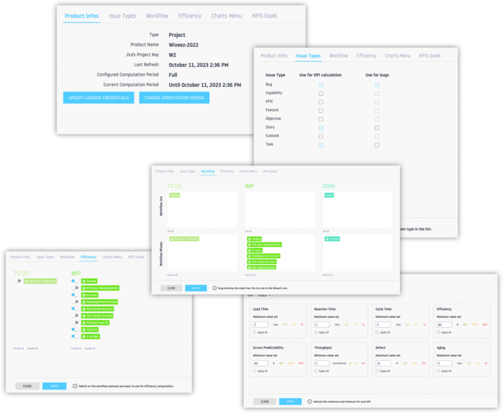
Configure Wiveez as you want
Personalize and adjust the displays according to your needs!
- Indicator calculation period
- Ticket types for calculating indicators;
- Processing flow for calculating indicators;
- Identification of active and inactive stages of the flow;
- Performance objectives on the main indicators measured.
…

“Wiveez gave us insight into our agile metrics […] while allowing us to identify different levers for improvement.“
GUILLAUME BERTRAND
ScrumMaster Leader
SNCF Connect